Electric Vehicle Charging Stations Dashboard with Google Looker Studio and Mapify
January 16, 2024
Mário Sobral

When British mathematician Clive Humby declared in 2006 that “data is the new oil”, he meant that data, like oil, isn’t useful in its raw state. It needs to be refined, processed and turned into something useful.
Here at Mapify we decided to provide this with a combination of Mapify and Google Looker Studio to quickly and easily generate reports and dashboards. In this article in particular, we'll give an example using Barcelona’s electric vehicle charging station status data.
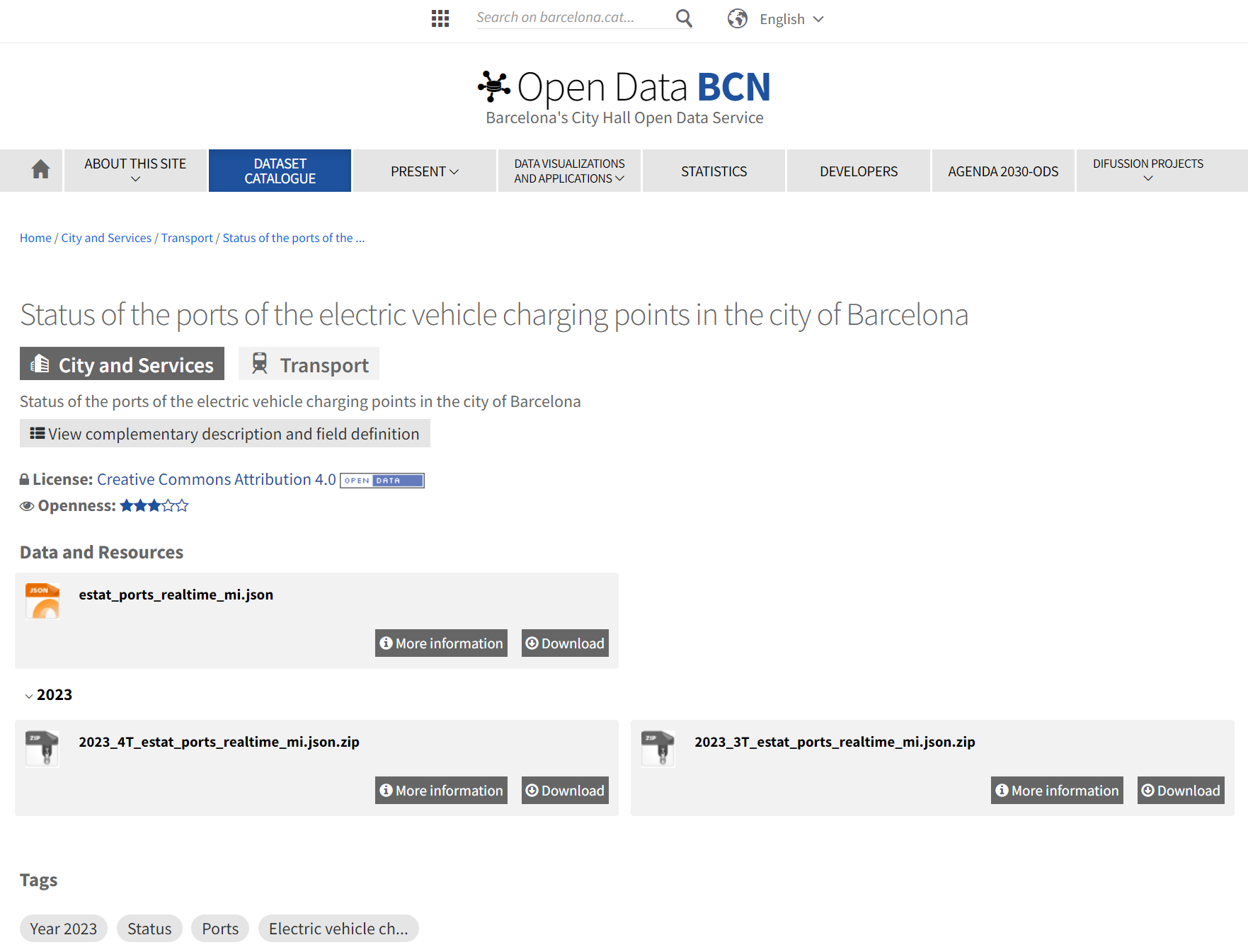
The city of Barcelona has a publicly accessible open data portal hosting dozens of datasets which provide a wealth of information from a diverse range of sources. A couple of those sources include detailed location information and the real time status of the electric vehicle charging stations in the city.
In previous articles we already described how to render your location data and how to get real time data into Mapify, so this article will focus on an example of how you can use Mapify’s Looker Studio connector to quickly build shareable and downloadable reports regarding Barcelona’s electric vehicle charging stations statuses.
Generate a Mapify API Key
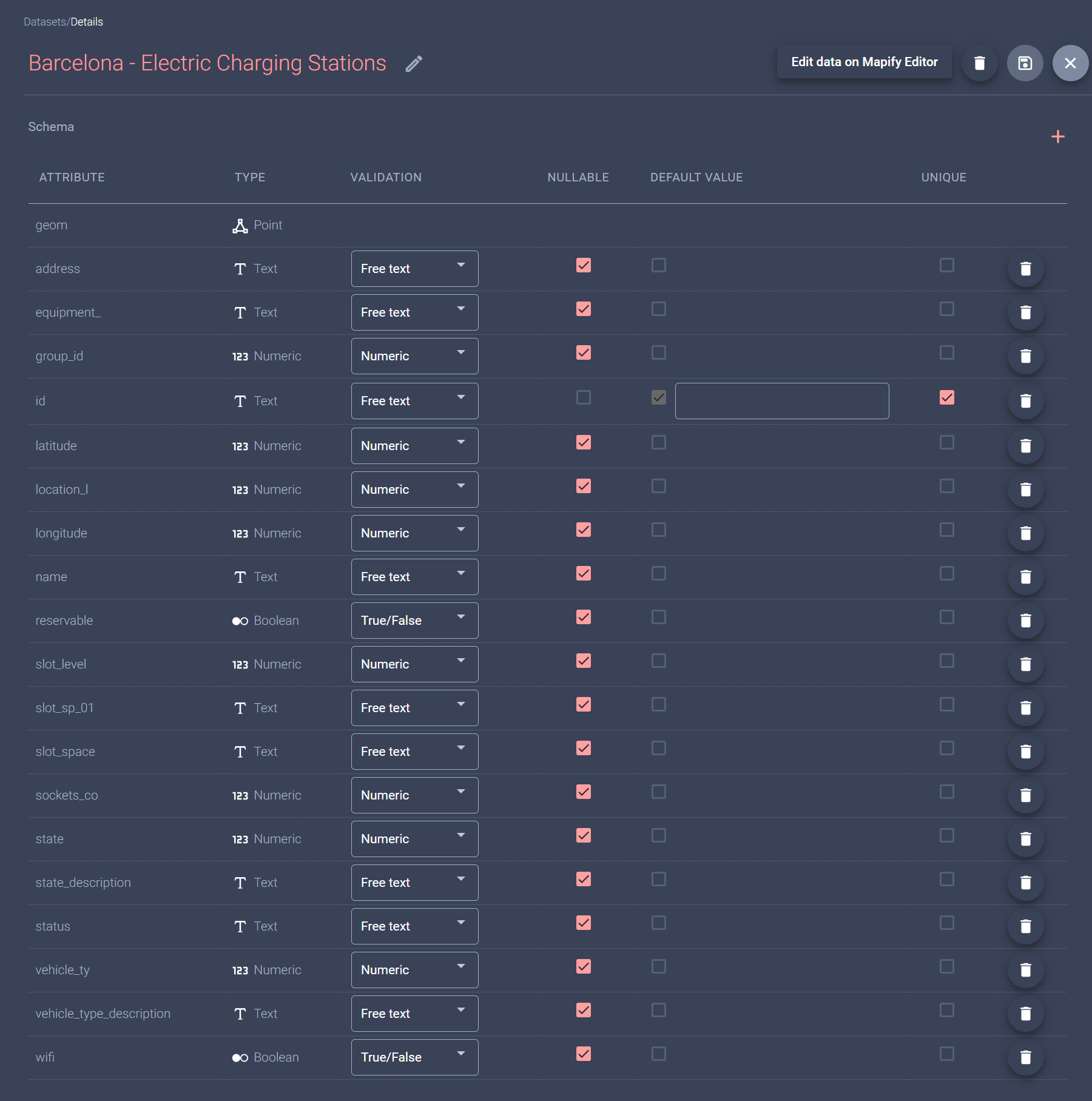
This article assumes you already have a Mapify Dataset which you are populating with real time data from Barcelona’s electric vehicle charging stations. In the example below, the dataset contains several fields, including a state_description field which will contain a string specifying one of several possible values for the current status of each station: Available, Unavailable, Charging, Occupied, Faulted.
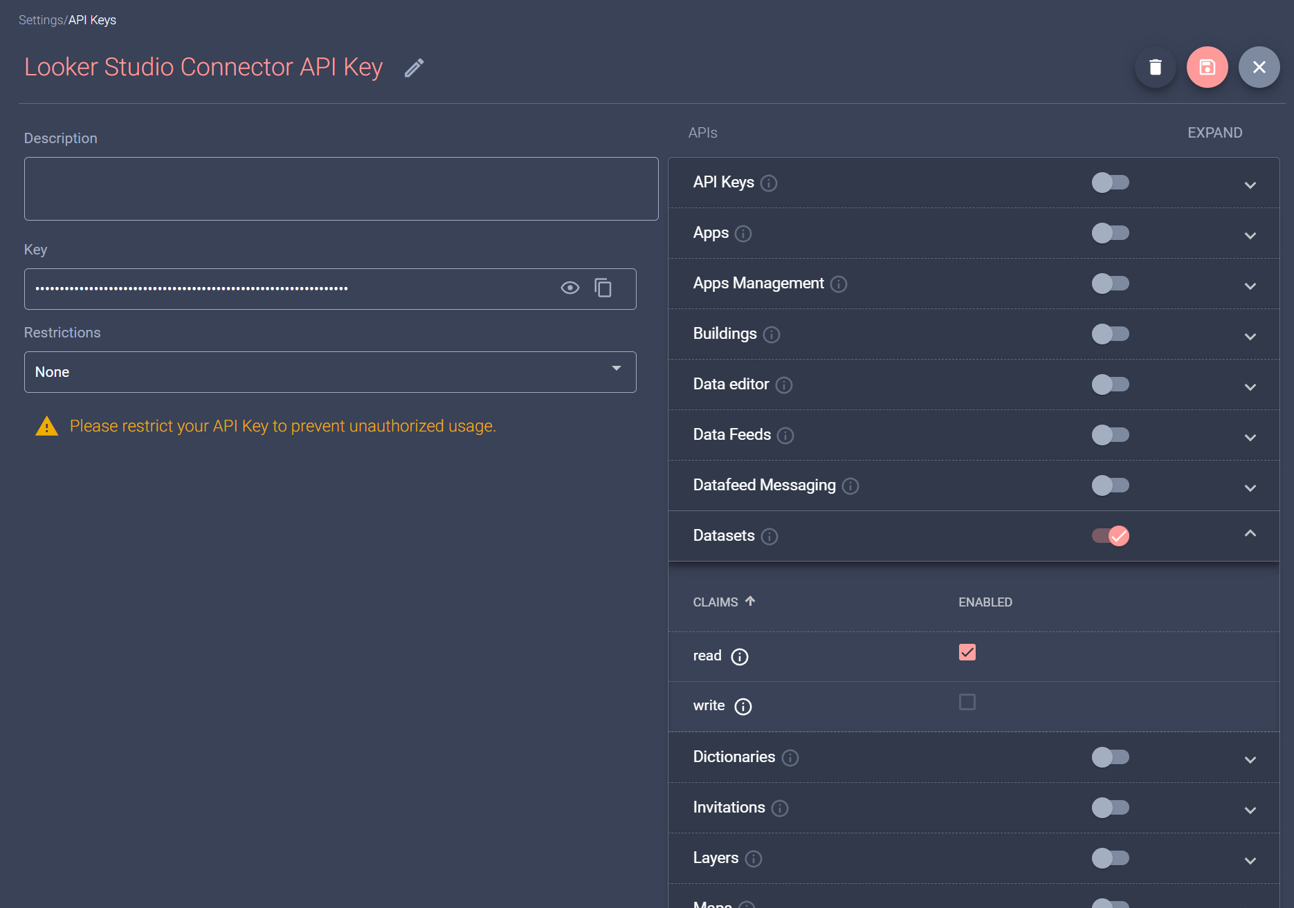
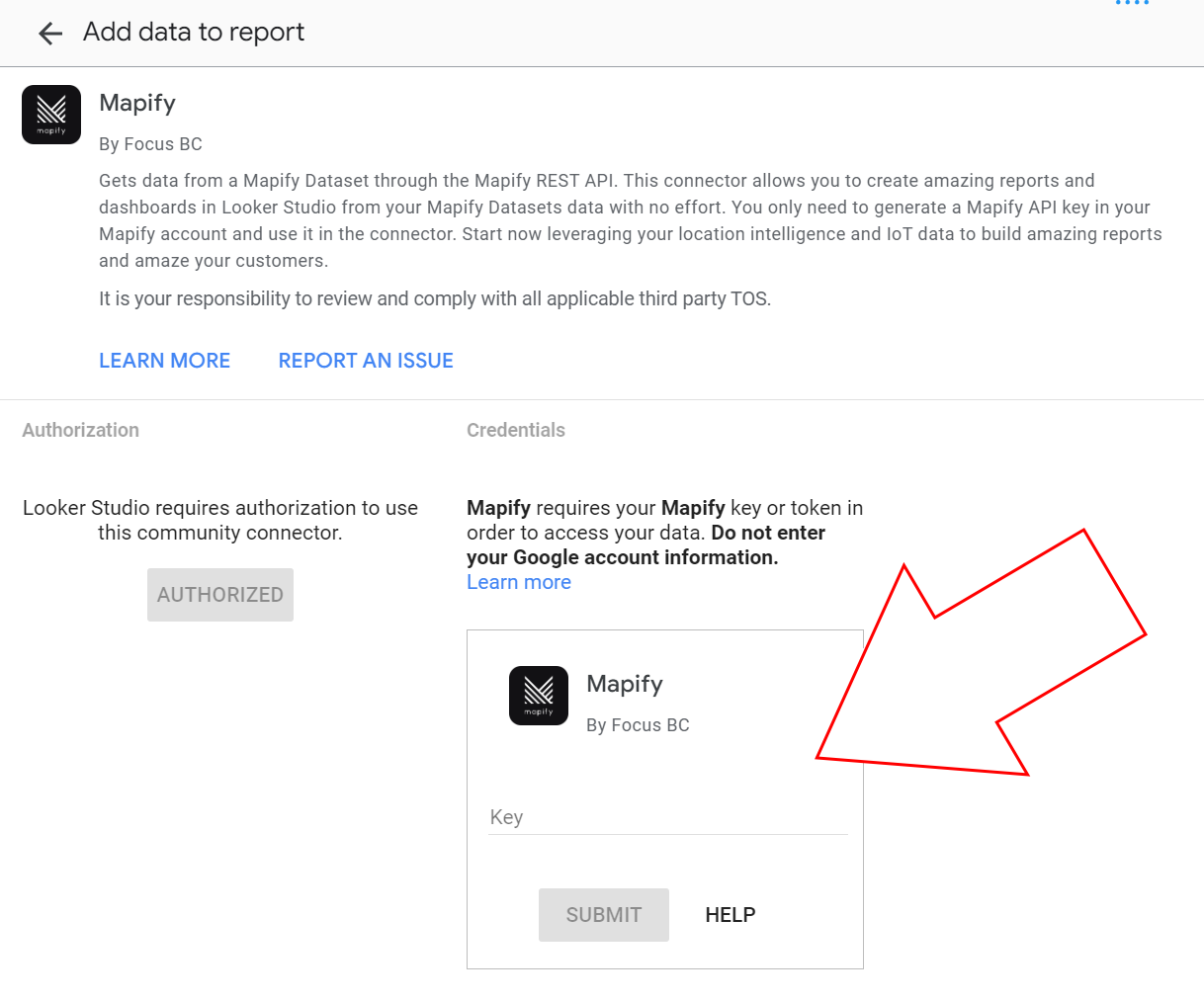
The next step is for you to generate a Mapify API Key which Looker Studio will use to connect to your Mapify instance. Go to your Mapify console settings page, and in the API Keys tab generate a new API key and enable the read claim of the Datasets scope.
Connect Google Looker Studio to Mapify
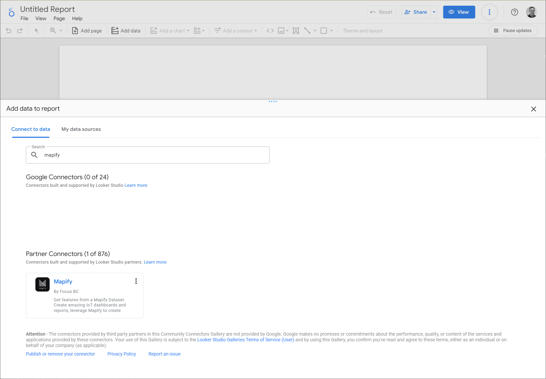
Navigate to your Looker Studio main page, and create a new blank report. You will be asked to select a data connector to use as the initial data source for your report, so search for the Mapify connector and select it.
Then, you will be asked to authenticate using a Google account, and to provide a Mapify API Key (the one you have created in the previous step). Be sure to copy the Mapify API Key you have previously created in the Key field of the connector credentials tab.
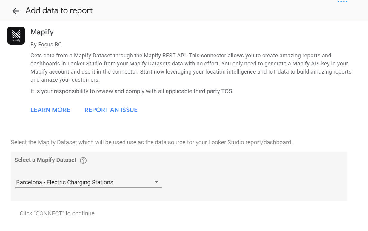
You can now select the Dataset in which you have the electric vehicle charging stations data.
Create your Google Looker Studio Report
Once you add the Mapify Dataset as your report data source, you are ready to add different tables, charts and controls to your Looker Studio report. Initially, Looker Studio will automatically add a new table with the Dataset’s data, but it will be a very limited example, using a simple dimension and random metric.
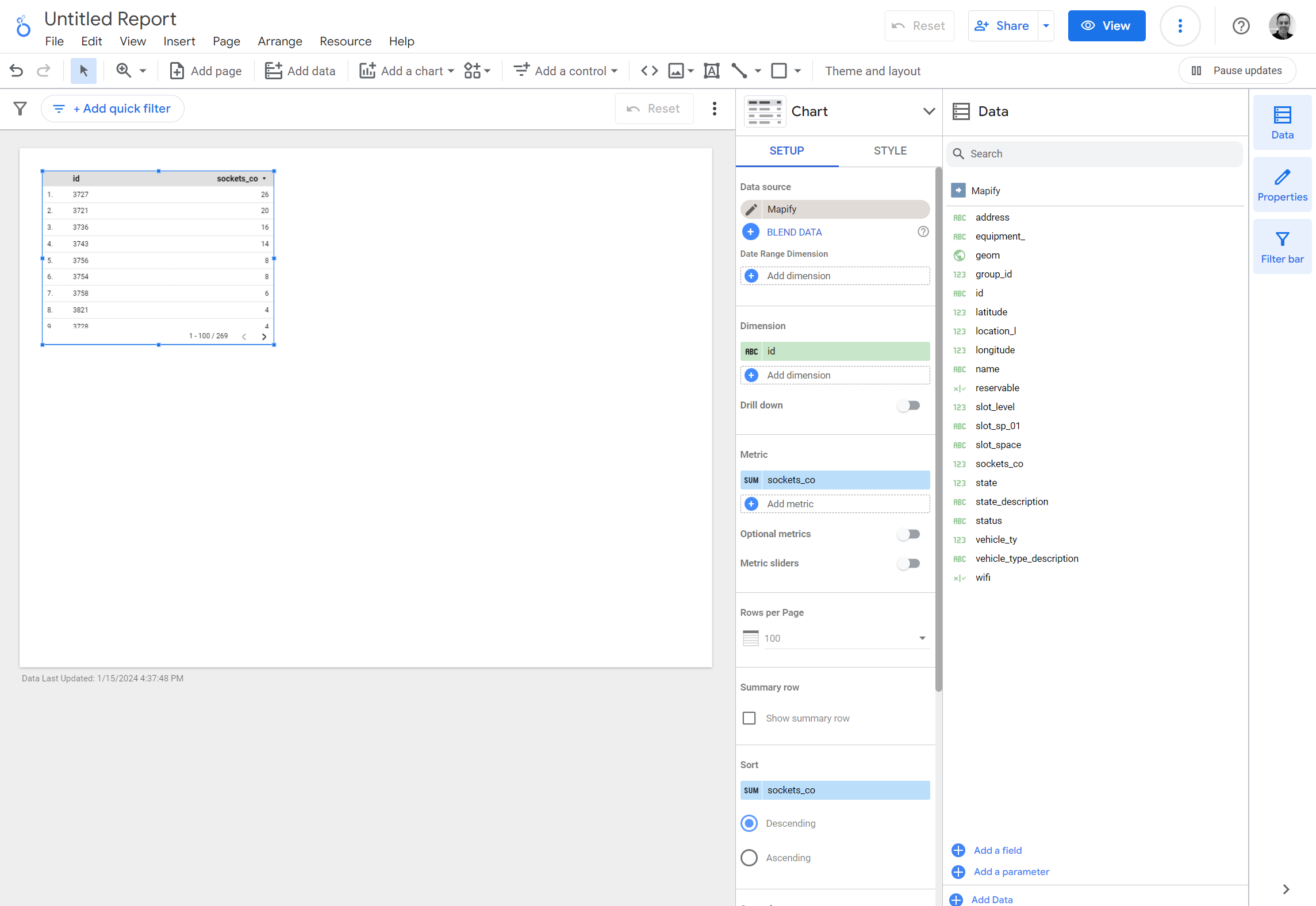
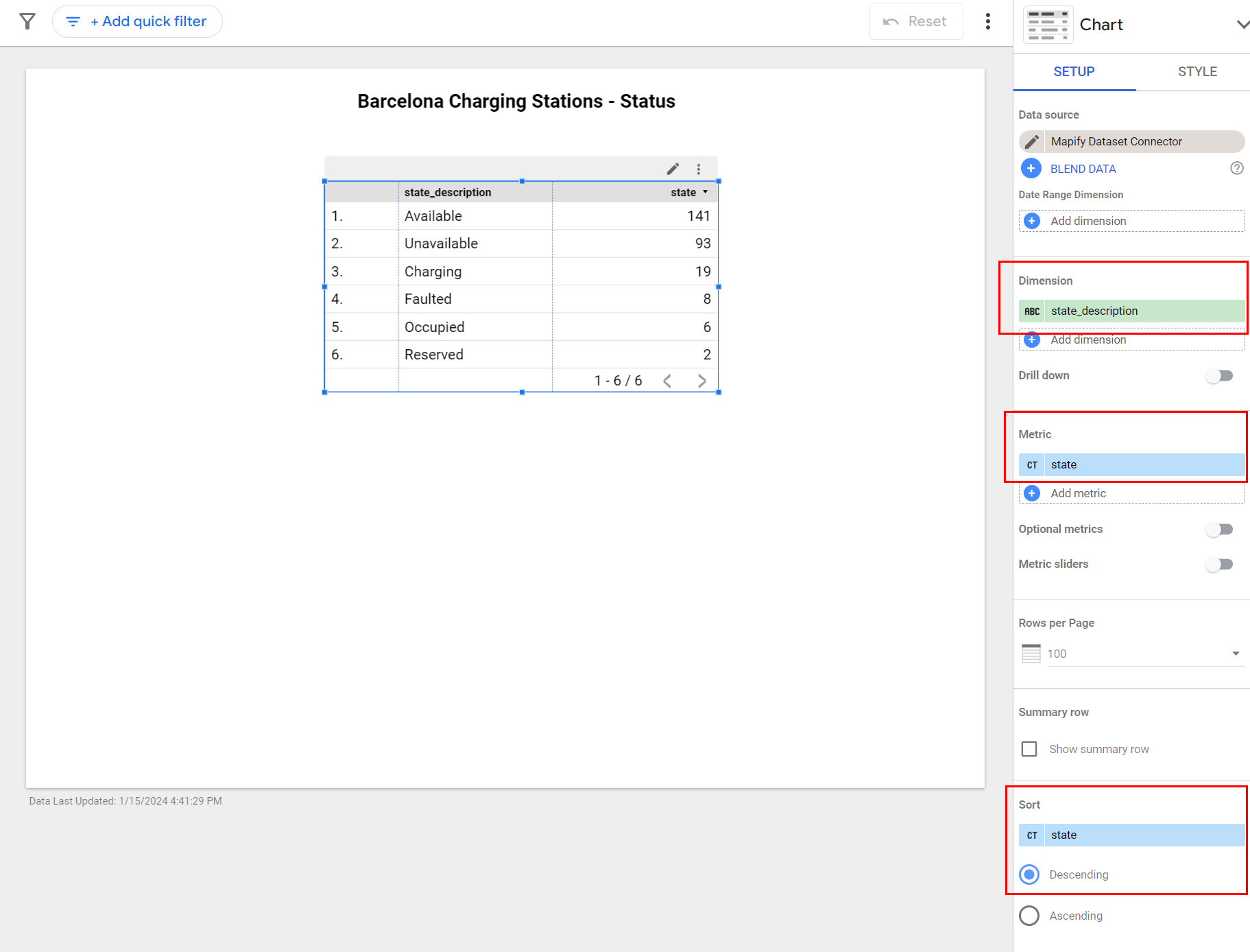
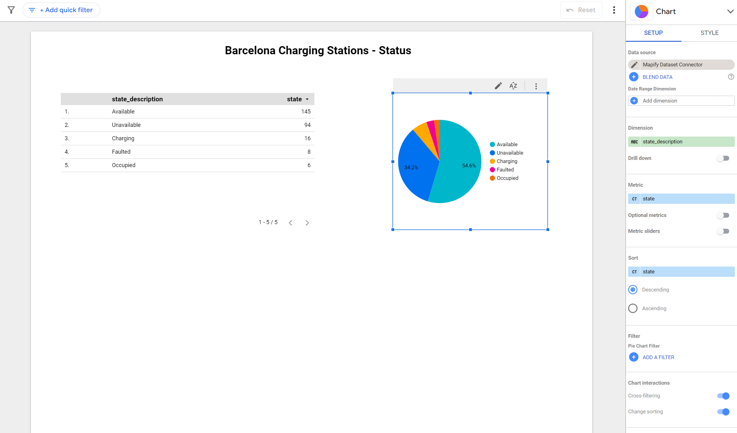
In order to make your table more meaningful, you need to select the table control in the report and change its main dimension and metric to meaningful values. See the example below, which selects the state field to group the data by charging station status, while assigning a metric which counts the amount of records for each specific “state” of charging.
You can also add several different types of charts, such as bar and pie charts, configuring their associated dimensions and metrics in a similar fashion. The table information above can be rendered using a pie chart.
Since the Dataset contains location information for the charging stations in the format of latitude and longitude coordinate fields, you are also able to include a map visualization in your Looker Studio report. For this specific example, add a new Google Maps “Bubble map” chart to your report. Configure the location field by selecting the geom field from the Dataset, select the “name” dataset field as the tooltip, and the “state_description” dataset field as your color dimension. It’s as simple as that!
You now have a Looker Studio report which will regularly poll the connected Mapify Dataset and update its associated report controls to provide you with a meaningful business view of your data, all with just a few clicks. Be sure to explore all the styling options for the reports, charts and controls, since it will allow you to provide amazing visualizations for your Mapify hosted data.
Start your free trial now and replicate this process with your own data – whether it's real-time or not. Plus, discover how you can easily create a Mapify web-based shareable app in just 6 simple steps. Let's transform your data into meaningful insights!
.jpg)